The P.O.P. experience: plus joy of the oval, gold into pink, & other exalted shop talk
John Yang and John Dugdale, joined by Dan Levin, Jessamy Dipper, and Judy Seigel
from Post-Factory Photography, Issue #9, April 2004
We’d come to John Yang’s studio on Manhattan’s East 51st Street to learn a lot in a hurry about Printing Out Paper, more commonly known as POP, or, to its intimates, “chloride” (because the halide is silver chloride).(1) When John Dugdale learned that the paper was still available, he realized instantly that he needed to add some POPs to his midcareer survey opening very soon at John Stevenson Gallery. And, having seen some of Yang’s sublime POPs at the Stevenson gallery (in this concatenation of Johns, we revert to last names), we both realized we needed to meet this great photographer and (all reports agreed) “fully realized” person. The event also promised a transcript for posterity and a fine feature for Post-Factory.
The hitch, it turned out, was that all present had such a good time they frequently failed to speak toward the tape recorder and, dammit, everyone talked at once, which cannot be transcribed. But here is the gist, that is, with jumping around and some filling in.
It was embarrassing in this exalted company to find myself suddenly all thumbs with my little Nikon. A year of using disposable cameras (another story, for another day) had ruined me. You hardly have to point those 2-ounce wonders; the lens is so small and wide everything is in focus. I’d forgotten that a real camera has to be focussed; in fact, I’d forgotten how to focus. But, “I’m planning to go digital and haven’t masterminded that yet.”
Of course folks asked which digital. I said I’d “mined the collective brain of the alt-photo list, also the B&H catalog, and both were a big help,” but I hadn’t fully decided, so, “who knows what mistake I’m about to make.” (I finally bought the Canon PowerShot G5, but have as yet no official verdict except that the manual leaves room for a lot of guesswork.)
Talk turned to Dugdale’s plan to add POP to his imminent show.
Yang: I don’t know how John can do it, change in two weeks! It takes me two years to shift gears.
Dugdale: We need the pressure. We’re so brazen and foolhardy.
Dugdale had printed one of his first shows in POP. The prints were, inevitably, beautiful, but he didn’t feel he’d mastered the process. His first question about the Centennial POP, now sold by Chicago Albumen Works, was, will it keep. “It does go bad,” Yang said, but “probably keeps about a year in the refrigerator.” Dugdale then asked for exposure advice.
Yang: I’ve found that you need a relatively dense negative to get the best color and gradation in POP. In my experience, most films today – TMY, HP-5+, FP4+, TMX – can withstand considerable overexposure, and because the process is contact printed, grain or loss of sharpness from the density is not a problem. Everyone has a tendency to undercook or overcook. I tend to undercook. If I were a cook at Thanksgiving, the turkey would always be undercooked.
Dugdale applauded the cooking metaphor, adding, “I call Dan ‘Chef Boyardee.’ When we get out the egg beater and the bowl, it’s like making a cake, with the silver and the gold and the egg and stuff.”
Yang had prints from the series he’s been shooting at John Boyd Thacher State Park on the wall, several of them in his amazing oval mats.
Yang: The park isn’t in the Adirondacks or the Catskills, but the Mohawk Valley, about 30 miles southwest of Albany, a line of cliffs running east-west on the New York Thruway going to Buffalo. These were taken from the Indian Ladder Trail, about 100 feet below the top of the cliff, accessible by steep iron stairs at both ends. It’s wild, but at risk, and trails are rough.
The area is a geological wonder; it used to be under water. The rock formations are from the land having risen, revealing itself. The fluid wavy forms are a direct result of action of the water. You can also see fossils, like tiny clam shells.
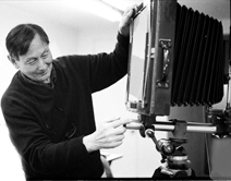
Dugdale: I’ve been so curious about the camera you lugged up into that beautiful valley...
Yang: That’s it right there.
Dugdale: I can’t see that far...
Yang: [Bringing it closer] It’s on a tripod.
Dugdale: I tried some of those old 11x14 cameras, also “portable” models, but I didn’t have much luck with them. They’re great in the studio, but the “field” one I had never worked very well. I had an 1890 Corona that was nearly impossible.
Yang: The front standard here is Sinar. The rear is an 11"x14" Deardorff reversible back mounted onto a custom wood frame that’s secured to a Sinar rail by a Bogen super clamp. And it comes off. [Demonstrates the back coming off, then holds up the ground glass, which has a white oval outlined on it.]
Seigel: What did you put the white on with?
Yang: Just a thin tape from an art store.
Seigel: You drew a circle and just stuck it on with sticky tape?
Yang: I traced an oval from a mat I’d cut. I have this oval cutter, which I try to cut my own mats with. I get about one out of two — you may think that’s pretty good, but you’re throwing away half your mats.
Seigel: So what? It’s a renewable resource [laughter]. But the mats that you get are 10 times as gorgeous as a plain mat.
Yang recalls the arch-top mats of Dugdale’s last show.
Dugdale: Yes, 8-ply Arches.
Yang: And they were cut with a 45-degree bevel. Many mat cutters do a 30° cut, but that shows less edge. A 45° cut is more impressive, especially with 8-ply mats.
Dugdale: I paid more for the mats than I did for the pictures.
Yang: I mentioned that to John [Stevenson], and he said, if it’ll make you feel better, there’s a long tradition in art where the frames cost more than the art.
Dugdale: Well, that was last year. This year I tried to calm down. But you have a studio Deardorff, not a... Oh ! It’s a modern Deardorff !
Yang: Yes, and it’s extraordinarily heavy. An 11x14" Deardorff weighs almost 30 pounds. My rig is more compact, and weighs less, but the total weight I carry in the field (camera, tripod and case) is 60 pounds.
Dugdale: The back just snaps off? I don’t know why I never thought of buying a modern Deardorff back...
Yang: The back slips off, secured to the rail by a Bogen “superclamp.” The bellows is made by a company on Long Island. They’re so cheap I feel I have to pad their bill. It’s .....
Seigel: Universal?
Yang: Yes, Universal. It’s a mom and pop... used to be mom and pop and dad, then dad died, so it’s now mom and son. But they still charge what they consider reasonable prices. All they make are bellows. These are 50-inch bellows. [Ed. note: Universal has since gone out of business.]
Dugdale: When I bought my 8x10 camera, the box had been closed since about 1910, and the camera and bellows were melted into one solid piece of goo. I sent it to them and they replaced it, I think for $125.
John, your camera is beautiful, beautiful and inspiring. Thanks for showing us. I got so discouraged with that large camera, but I think I’m going to try it again...
Yang: Get a Sinar front. It also helps to get a levelling head. You can level that view camera on the slope without having to make all the adjustments individually. [Demonstrates tilting]
All: Oh wow !
Yang: There’s a bubble level on the leveling head, and once you get the bubble right, the camera is level, everything is level. Then, if you want to, for instance, pan and tilt, you don’t have to readjust everything.
Dugdale: Have you been doing landscapes forever?
Yang: I’ve been doing them for a long time, but not with an 11x14.
Seigel: In the ’80s, I think, you went to, was it the Innisfree Gardens?
Yang: Oh, that was a wonderful place, a really unusual garden, in Millbrook, New York.
Seigel: Why isn’t it better known?
Yang: Because most public gardens are commercialized horticultural spectacles. They also tend to be extensions of houses. There is no longer a house at Innisfree; the garden stands on its own, and open to the public.
Innisfree was originally designed to be an English garden, and the house was an English house. Then the artist-painter, Walter Beck, who originally designed it, saw a print of a Chinese garden in the British Museum and was taken over by it. The house was already built, by big-shot New York architects, Carrère and Hastings, but Beck changed in midstream and built his own Chinese-inspired garden.
But it was all third-hand, because the print he had was a copy of a painting by a Chinese poet, Wang Wei, a poet, painter, and scholar. In Wei’s version, a garden was itself a picture. Both garden and painting were pictures. He would work on the garden, then he would paint it, then he would do the garden from his painting, and then he would write a poem about it and work on the garden again.
Seigel: When did he live?
Yang: Wang Wei was back about 400, I believe. Walter Beck was in the early 20th century. He had a disciple and protegé, Lester Collins, who taught landscape design at Harvard for a short while. I think they kicked him out because he was such a maverick. When Beck died, he took over. He would reduce and simplify until the essence of a landscape as he’d originally sensed it was revealed.
Dugdale: I’m not usually very technical, but I’d love to know what kind of lens you have on the camera.
Yang: This is a Dagor, a 21 cm/F9 Zeiss wide-angle Dagor. It covers around 100 degrees.
Dugdale: It’s beautiful. I have a new Dagor 4x5 for my 5x7 camera. It’s too small to use any more, with my eyesight, but I still love it.
Yang: I can use all those old lenses because I have a Sinar shutter that accommodates up to 80 mm wide, which saves on bulk and weight.
Seigel: How many film holders do you take on a trip?
Yang: That’s what’s heavy.
Seigel: They cost about $125 or $150 in that size, don’t they? But, John, don’t you get yours custom made of solid antique cherry?
Dugdale: Not any more. They’re made by Lotus,2 and very nice, but they’re so hard to get from Austria. Now I’m thinking maybe I should try to buy them by computer, instead of by phone. I’d love to have 4 more of those Lotus wood film holders.
Yang: Contemporary American film holders for 11x14 are x-ray holders. They’re heavier and not cheap (about $250), but probably cheaper than Lotus. I can manage four of them, and if I really feel good that day, five. But you have to climb a ladder to operate the camera, and climbing a ladder with that weight.... [Shows case, 8-1/2" wide by 18-1/2" long by 14" high.] Everything’s carried in this case.
Dugdale: Wow ! It all crushes down to fit in this box? Fantastic !
Yang: It just fits in. It was custom made to take everything.
Dugdale: I’m so impressed. You’re so organized.
Yang: I blame it on my architecture background. And it’s also because I can’t see any more... or relatively. I have these flip glasses. [Demonstrates glasses, flipping hinged lens up and down.] With them down, I can see close, with them up, I see distance....
Dugdale: I’m green with envy. I’m going to look for those.
Seigel: Is that a standard item or something you invented?
Yang: You go to an eye store and ask for glasses with an attached top-hinged frame.
Dugdale: Here’s my version: It’s so grandpa, but it works. [Puts one pair of glasses over another.] So I wear both pairs, like a maniac, but then they fall down and I step on them, or sit on them... I want one of those !
Seigel: Isn’t that the same effect as bifocals?
Dugdale: Much stronger. These are 9X magnifiers.
Yang: Variable focus eyeglasses are difficult to focus with.
Seigel: When I’m working close-up, I put one of those things on my head like a miner’s lamp, over my glasses. I use that for spotting and so forth, and it works perfectly.
Yang: Oh these are great for spotting. Three times magnification.
Seigel. I never saw them on anybody; or maybe they just don’t wear them on the street?
Yang: I don’t think they’re very fashionable.
Seigel: Jack Levine, who lives across the street from us, told me he had his bifocals made reversed, with the distance part below, and the close-up part above – for painting. The optician gave him a very hard time about that, nearly refused to do it.
Yang: Oh they will... And sometimes they yes you to death. I say, for instance, “I need glasses where I see something exactly at 14 inches away.” And I see him writing down “reading glasses.”
Dugdale: I’m going to jump forward: Dan and I have had a burning debate for the past 3 days, since the box of paper [from Chicago Albumen works] came. We want to know if the alkaline chemistry you use is from the supermarket, or from a chemical supplier, because Dan seems to think, probably rightly, that we could go and buy borax from the hardware store. Or get a can of baking soda from D’Agostino’s.
Yang: I’ve used both and I can’t tell any difference. I used 20 Mule Team Borax... [Shows box, to chorus of comments about stylish graphics found on upper east side, not in downtown supermarkets.]
Dugdale: One thing that moved me so much about your prints is the beautiful pink...
Yang: You won’t get that with borax. For that you use carbonate.
Seigel: Sodium carbonate? That’s washing soda. [To Dugdale] I’ll give you some. I have a jar from Kodak, but I have a box of a couple of pounds of Arm & Hammer Washing Soda that cost about $2. The only difference is the perfume. [To Yang] Do you tone your prints?
Yang: It’s Chicago Albumen Works’ formula, a stock solution of 1 gram of gold, 500 ccs distilled water. But I don’t tone one at a time, because it takes forever. I actually tone eight at a time, back to back, four emulsion down, four emulsion up (up down, up down, up down, etc.). To agitate, you take the bottom two, and flip them together to the top, then separate them.
Another trouble with toning singly is that you have to replenish, and you never know how much to replenish. So there’s no consistency. You can get maybe a terrific print, but you’ll never be able to get it again. (Though maybe you’ll make a better print !)
Seigel: You do eight and then discard the solution?
Yang: Yes, I dump it and mix it all over again. For eight 11x14" prints, I use 12 ccs Chicago Albumen Works formula for the gold toner stock solution [part B] per print , that’s 96 ccs, plus 4 grams sodium carbonate, to make 2-1/2 liters working solution.
I arrived at that ratio over the years, working with the alkaline-based toner. The alkaline toner for POP is really I think superior to the thiocyanate, which was the only formula they [CAW] gave when they first came out with POP – although it’s great for getting split tones.
Dugdale: What about the prints in the oval mats in the gallery. Would you consider them split toned?
Yang: No.
Dugdale: If I look closely with my magnifying glass and the right magnification, I can see great detail, but what was so beautiful to me about those prints was the color. I knew they must be as beautiful as John Stevenson described them, with the flowering branches hanging down. It’s easy to see the influence of the Chinese garden, the depth that magnifies the distance, the beautiful infinity. What I saw most, though, was that beautiful glow of pink... They did look like they were glowing.
Yang: Actually, there is some split tone. But not the kind of split you get with thiocyanate, where you get blue highlights, and ochre, olive shadows. And then the whites aren’t all that clean with the thiocyanate. The prints tend to be a little depressed. And the midtones tend to get pushed into the shadows. But with the alkaline toner, it’s different. With the POP of the last couple of years, however, if you use the borax, which is the formula they give from Chicago Albumen Works, the tones tend to be neutral, on the cold side, given other things equal.
I’ve combined carbonate and borax to get inbetween hues; the color isn’t entirely predictable, and in any session I usually end up with a range of colors. When prints are all the same color, it tends to be on the cold-toned, neutral-black side.
But for warmer tones, before they’re bone dry, put the prints between blotters in a hot press. You can’t do that after it’s dry. The temperature of the wash water also makes a difference in color. Above 68° warms it up, but also tends to leach out color.
Dugdale: That’s what I wanted most to not do – the chemistry ! Dan has a wonderful tenacity about process and chemistry, which is a great joy to me. I can do the romantic aspects of everything, but I never did figure out how to make the chloride paper toner warmer.
Yang: You have accidents you can grab onto.
Levin: We know !
Yang: And then the minute you think you have something right, the next time you do it will prove you’re wrong.
Seigel: Seigel’s Law: It’s three in the morning and you’re tired, and this isn’t going to work anyway, but you’ve got to get it done, and you don’t take notes and you don’t write anything down... That will be the most glorious print you ever made and you will never get it again.
Yang: I think you’re right.
Dugdale: But from your experience over the past two years using the borax, and the carbonate, what gave you that beautiful color?
Yang: I don’t know what it’s due to. They’re all alkaline. Carbonate’s the most alkaline, borax I think a little less. Then bicarbonate, then sodium acetate, and a few others.
Dugdale: I had such a rush of feeling when I saw those prints taken from up so high... I can picture it, though I can’t see it in actuality... When you were taking it, did you feel you were having a sort of transcendent experience, or were you pulling your hair out with details? [Laughter]
Yang: There are some subjects that I wrestle with. Not necessarily ones I’d have an interest in if I weren’t photographing them. After Innisfree, which was sort of made-to-order for the panoramic camera (a Cirkut No. 10), I went on to golf courses, partly (or mainly) as a challenge, because the subject seemed so antithetical to the way the panoramic camera sees. Photographing golf courses was a wrestling match; Innisfree was a natural fit for subject and camera.
I never play golf. I never had an interest in playing golf. I don’t like country clubs. But it was a challenge to see what I could do photographing golf courses. The Chinese garden sort of fits with panorama cameras, because you’re in the garden itself. You’re part of it, and you’re photographing around yourself. You’re not outside taking a picture of it.
Dugdale: The landscapes of the Mohawk Valley had a similar feeling. I did not feel that I was looking at it... Besides the beautiful process, with the pink and all that – it’s such a tired word, but the composition is so beautiful.
Yang: With the valley you feel engulfed. You have the overhanging cliffs above and behind, the waterfall in front, and the distant slopes and valley beyond.
Dugdale: It’s so nice to chat with you, because you can see where it came from... Nothing comes from nowhere. Every time I’ve had a show, invariably a dozen people ask me, “How long did it take you to make these?” And I always say “forty-four years (or forty three, or whatever birthday I’m having).” It doesn’t happen in a week. I don’t want to sound too mushy, but I rarely see work anywhere, by any contemporary photographers that I would love to have in my home. I don’t even have my own work hanging up.
Yang:: I think 11x14 has something to do with it, too. It really slows you down. You cannot just go there and blast away.
We are now looking at matted prints from the current Mohawk Valley series.
Dugdale: I love the color of this....
Seigel: To me, it’s also that oval, which is so... compelling.
Yang: I did ovals before, but they’re all still in the closet and I didn’t feel like showing them to anybody. That was 8x10.
Seigel: Do you like them better now? Have you looked at them since you started these?
Yang: Oh, these were made to be oval. I finally said, if I’m going to do it, I’m going to put it on the ground glass.
Seigel: To view it in the oval from the outset...
Yang: The rectangle sets up its own, different dynamic...
Dugdale: So does the tablet shape I’ve been using. The tension that the arc creates makes the composition dynamic. We used to use a template on the ground glass, but now we can judge pretty much how to make the photograph. Then later, when we put the mat on, it comes alive. It can be sort of bland without that arch, then it jumps to being alive.
Yang: It does. And the whole idea that every picture has to have four corners, and four sides... that gets you into the academic exercise, “If you have nothing in the corners, it’s a lousy picture...”
Dugdale: That’s artspeak !
Yang: Or the pronouncement that “this edge needs” whatever. With an oval you can just bypass all those issues.
Seigel: There’s something else about those “lines of force” – the oval sends the energy back in. With corners, the energy can go out from every corner !
Yang: An oval is just presented, and that’s it. It tastes good, it doesn’t taste good. With a rectangle, it’s like serving food on a square plate, with sharp corners !
Seigel: Maybe I’ve just never seen an indifferent photograph presented in an oval, but I have not seen one in an oval that wasn’t luscious. Maybe only good photographers put their work in ovals?
Yang: About two-thirds of the pictures I left at John Stevenson’s are rectangles.
Seigel: But I was most thrilled... no, that’s not entirely true, because many are thrilling. (Is that a waterfall going down, or a geyser going up, I wonder.) But the oval adds its own magic.
Dugdale: They knew what they were doing in the 19th century, either by intuition, or conscious choices. I used to think, eh, that’s just the old style. But it was always so compelling to me, always, from the time I was a child. This is a good moment to think why.
Seigel: But there may also have been some selection over the years, with the strong ones preserved, and the others, some of them anyway, just falling away.
Yang brings in a book.
Yang: This book is something my daughter gave me to look at — a fan shape.
Seigel: I was doing a series like that, with gum prints — I had some fan shapes, and a few others, exactly in homage to (or imitation of) these shapes... Does that remind you of a mango, or...?
Yang: Reminds me of a gourd, or a pumpkin... It’s sort of squat.
Dugdale: John, over the next few days we’re going to have to make about half a dozen [POP] prints for the show.... I have some beautiful negatives from early on that didn’t work in platinum or cyanotype or albumen. I made them for Printing Out Paper in 1990, but they came out so reddish... Now I’m hoping we’re going to make them pinkish...
Yang: Dense negatives are better than thin.
Dugdale: We have nothing but bulletproof negatives, to use Judy’s term.
Yang: That’s great, because that’ll help the pink. However, I found pinkness is not perfectly reliable. You’ll do all these things and you’ll end up not having a pink print.
Seigel: If there’s something you really love, and you can’t print it, you can have it scanned and ....
Yang: That’s not the same. You hear people say, and it really gets me sick, “It’s all about pictures.” And I say, well, if it’s all about pictures why do I have to do all this?
Dugdale: You are never going to see light being bounced off a print by a computer...
Seigel: No, no, no ! I’m not talking about the print, I’m talking about the negative. You can have the negative scanned and made printable for your process, tho there’s analog stuff you can do first. Like an [RA-4] (3) bleach. It’s a compensating bleach, unlike Farmer’s reducer which they say you can mix to be compensating, but that’s not true, it doesn’t compensate.
Dugdale: What does it compensate for?
Seigel: If you bleach a too-dense negative, with most silver bleaches everything bleaches at the same rate. So while you’re lightening the darks, you blow out your lights, because they have less total silver. The darks will be helped, but the thin parts get lost. They say Farmer’s Reducer has a dilution that “compensates,” but that’s a myth (and still in all the reference books). If you actually chart the curve, you’ll see it remains the same. But there is a bleach, which will “compensate,” where the darks go more rapidly than the lights....
I just took the folder out of the file this week, because for my last issue I want to empty the drawer. There are some formulas I never got in an issue and I am determined to fit them in now.
The tape reversed, losing some dialog, and discussion of John Yang’s current round of chemotherapy for colon cancer.
Dugdale: For the record, this is November 13, 2003, ten years to the day from November 13, 1993, when I had my big paralyzing stroke. I had cancer, too, and a whole bunch of things that should have killed me. Now I hope to see 70.
Seigel: I’ve got news for you dear, when you’re 70, it doesn’t seem old. Ninety is better.
Yang: I was 70 last April.
Dugdale: I’m nauseatingly positive minded. I will keep you in my thoughts while you go through this. I think I get it from my Roman Catholic mother: It’s good to have as many people thinking the right thing while you’re going through something like this as possible...
Now what else... I know I’m going to think of 50 things I want to ask after we leave.
Yang: One of the things that leads to the color is the batch of paper itself. They’ve been quite consistent, but with some batches I couldn’t get a warm tone. Then, the denser the negative, the longer the exposure, which makes pinker tones. Burbank and Abney also say the rate of toning, which is dependent on the strength of the toning bath, is important. They recommend a weaker bath, which takes longer to tone.
Dugdale: You made my day by saying my negatives are good. We have some that get exposed two hours.
Yang: Two hours is good. Or three hours, four hours... the time is very important. The other thing is, you shouldn’t wash it too much.
Dugdale: The initial wash?
Yang: Yes. Some people say, George Tice, for instance, says somewhere that the print should be rinsed until the water is clear. That’s contrary to Abney, who says that a partially-rinsed print tones better, both in color and resistance to bleaching in the fixer (Treatise, 1901). I agree. And when I mentioned that to Doug Munson, (4) he agreed, too. You need some of that loose silver. That’s why he says wash in slow running water, not vigorous, for one or two minutes at most. I’d do it for one minute, except I have 8 sheets to pre-wet, so I add another minute. The whole tray will be very cloudy. Don’t drain it too much: You want to retain some of that silver in the gold bath. Otherwise, the toning acts too quickly.
Seigel: What if you diluted the toner? Liam said he does that sometimes.
Yang: I’ve never done that. Who did you say recommended it?
Seigel: Liam Lawless. He’s our master artist of toning. And he did the article about making your own gold chloride. Remember “The Gold Flap”?
Yang: Oh, right. That’s something I haven’t tried — another variation. I tone 6 or 7 minutes, and the temperature of the toner is very important. I try to keep it at 68° (20°C). You could do it at 70, or 72°, but I’m not sure if warmer temperature means warmer color or colder.
The water coming out of the tap in New York is colder than 68°, even in summer. So I use a coffee heater with a thermometer in it. I do 68° so I can keep the toning time constant. If you tone for 8 minutes, you’ll see it definitely colder. But if you go down to 4 or 5 minutes, you’ll get a warmer tone.
Dugdale: In albumen too?
Levin: Yes, the more you tone, the colder the tone gets.
Yang: And if you platinum tone POP (5) you can tone for 15 minutes...The extended toning gives a feeling of great depth to the highlights. They’ll be just wonderful. You don’t have to worry about getting cold tone, because you have cold tone already. It’s like gold toning with GP-1. You can actually increase the separation of highlight detail if you over-tone. Also, if your print is too warm, you can run it through GP-16 and cool it off. But there’s no way I know of to make something that’s too cold warmer.
The toning is a one-shot procedure. You fix the toner fresh each time. After 8 prints you dump it and mix fresh. And then you make another 8 prints. And so on.
Seigel: Where do you get your gold?
Yang: From Goldsmith. They’re best, because they’re the only ones I know of who keep it in glass capsules. It comes in glass and then you break it in the distilled water.
Dugdale: It comes in an ampule? Now that’s “Mr. Science.”
Yang: I think Goldsmith has the best prices, too.
Dugdale: Have you ever printed outside in daylight?
Yang: I printed my panoramas outside. I didn’t have a printer that size, so I exposed under glass. Now I have an electric printing light. When POP first came out from Chicago Albumen Works, the French company made it on singleweight paper. You could get 100 sheets (now it’s a 50-sheet box). It also came in rolls. The print was 6-1/2 feet long by 10" wide [about 2 meters by 25 cm]; there was no way I could process that entire print in a long tray. I did it by rolling back and forth [demonstrates arm motions] in the different trays. Doubleweight was too thick for that.
Group moves into the darkroom, which has two printers on the table and a ceiling exposure unit, two of the three made by Yang. One printer has the standard Black Light bulbs, GE#47718, F25T8/BL. The other has aquarium bulbs, Voltarc F20T12/AQA/BP-40W. This, Yang explains, is a way of varying contrast. The AQA bulbs give greater contrast. Exposing a print to more of one light, less of the other, gives intermediate contrast.
The double row of bulbs on the ceiling are regular 15-watt incandescent bulbs, “the kind you put in a nightlight,” Yang says. On a track about 7 feet long, with extra bulbs at the ends, they’re for exposing panoramas on DOP. (He checked with an exposure meter to be sure light was even.) The gels under them, one magenta, one yellow, adjust contrast.
Yang: Exposures with POP are longer than many people have patience for, but the ones that take hours seem to make the best prints. With DOP [developing out paper] you aim for a relatively thin negative because those enlarge best, but they make lousy POPs. For POP you want a much denser negative. When the negative is too thin, the AQA bulb increases contrast, like using a variable contrast paper with a deep magenta or #5 filter.
Seigel: Do the AQA bulbs work for anything besides the POP?
Yang: Yes, for platinum printing and I suppose any other alternative process. The color of the light makes the difference in contrast. Sunlight is the least contrasty (I think, I haven’t used it for a long time). You progress up to black light, then the aquarium light, then regular fluorescent. I have occasionally used a so-called 5000 K light – exposing for days.(6) (That’s the bulb used for viewing slides.) You can expose for 3 or 4 days on that lightbox. You have to keep track, because after a couple of days you forget what time it is.
Seigel: Why the metal grid over the bulbs?
Yang: You can put neutral density gels on them in various areas or shapes to dodge and burn. Neutral density gels, translucent film, metal screws, etc. But if you don’t ventilate your bulbs, you’re going to lose light. The hotter the bulb, the less output. The light boxes have built in fans.
Leaving the darkroom:
Seigel: How did you happen on the Mount Zion cemetery?
Yang: My son is a musician; he likes to draw in his free time. He knew about the cemetery, and invited me to come along. While he was sketching, I was just walking around; then I saw the portraits... I was utterly overtaken.
Seigel: I suppose they look solarized because the heavy silver flaked off?
Yang:: They weren’t supposed to do that. They were considered permanent because the silver image was glazed and backed onto metal or ceramic tablets, but there may have been residual chemicals which acted on the image that caused the deterioration, perhaps accelerated by light. Outdoor extremes of temperature were probably a factor, too, and pollution could enter through cracks in the glaze. On some, the photo image had completely disintegrated.
Seigel: Except the retouching.
Dugdale: ...and they are so eerie! And so beautiful.
Seigel: [to Dugdale]: Your friend, Joseph Astor, told me he’d seen some in a cemetery in Paris, and kept going around and asking until he found one old man who knew how to do it.
Dugdale: He had a show here in New York of telephone poles and wires, etc., that he’d photographed in that cemetery – produced in Paris in those enamel cartouches, which made the photographs electric.
Seigel: [Taking final look at the Mount Zion prints] To me, this picture of the trucks rumbling by on the side, with the graves, the dead people in the center, surrounded by the world, is so wonderful. I’d like to be buried in a place like that. [Afterthought: And to have a solarized tombstone !] One reviewer said he thought you shouldn’t have taken the wide-angle picture with the trucks and the highways around it, but to me that’s the most poignant of all, exactly how it is, yesterday and today in Queens.
Dugdale: John, do you have a name for this photograph? Do you title your photographs, or just the location?
Yang: I can have a hard time remembering. That one was taken from, let’s see... there’s two falls there....
Dugdale: Then the photograph could be called “Two Falls.”
Seigel: Title by Dugdale.
Dugdale: That’s my favorite part of the whole thing.
John D. thanked John Y. for his generosity, “Just like John Stevenson said.” But Yang was, as usual, modest:
Yang: It doesn’t mean that anything’s going to work.
Dugdale: The partial mystery is part of the fun. If it was all down pat, we’d be bored to death.
Seigel: We have the computer printers and the inkjets, but they don’t feed the soul. The soul needs to go mano à mano with the universe !
John D. and Dan made 6 POP prints in the next several days, which were not only beautiful, but beautifully pink. (7) John Yang visited the show and said they’d got it !
Notes:
(1). Yang explains that “an excess of silver chloride in the emulsion accounts for the ‘printing-out’ of the image during exposure. ‘Developing-out’ papers only form a latent image during exposure, which must then be developed to make it visible.”
(2). Lotus View Camera, makers of “Finest Large-format Cameras and Accessories,” also European distributor of Post-Factory.
(3). The bleach is RA-4, not to be confused with Kodak’s R4-A, which is Farmer’s Reducer. This RA-4 is Part A of Kodak Ektacolor bleach-fix/RA-4, reddish in color, available from photo suppliers. It’s also made by Jessops in England, and FujiHunt, probably among others. In my tests it worked like a charm. Diluted 1:2 or 1:3, with time of 2 to 3 minutes, it gave almost any curve desired, with no loss of highlights. It’s used for color technology, for “desilvering,” and apparently never made it into the b&w canon. See www.fujihunt.com, under their EnviroPrint Chemicals for FA/RA4 process.
(4). Munson is co-owner of Chicago Albumen Works. CAW also sells related chemistry, provides much info, and offers many services. www.albumenworks.com
(5). John Yang says “Kevin Sullivan of Bostick & Sullivan has worked extensively with platinum toning POP, and B&S offers a Platinum POP Toning Kit. Kevin is an enthusiastic and generous fielder of questions: 505/474-0890, or kvnsllvn@yahoo.com.”
(6). See Jon Bailey, P-F #3, p 20, on split-toning with GP-1.
(7). Seeking “normal density negative” specifics, Dan brought over 2 negatives that printed well and I densitometered them. The “flat” one was 0.26 for darkest shadow, 0.95 for midtone, and 1.25 highlight. (About the range for gum !) Its exposure time was 15 minutes. The dense one measured shadow 0.65, midtone 1.40, highlight 1.70. Its exposure was 40 minutes. We speculated that Yang’s exposures may be longer because of the metal grid and mylar diffusers over his lights, but his negatives are almost certainly much denser. Also, odds are the AQA bulbs (higher contrast) are slower.
Editor’s Note: Finishing this story, I wondered aloud to John Yang about mentioning Chicago Albumen Works so many times in one article. He exclaimed (and I do mean “exclaimed”) that it’s OK. “There wouldn’t be any POP without Chicago Albumen Works. They don’t just distribute it. They got the company in France to produce it, and then the one in England.” (Kentmere.) “And it’s a great paper.” JS